
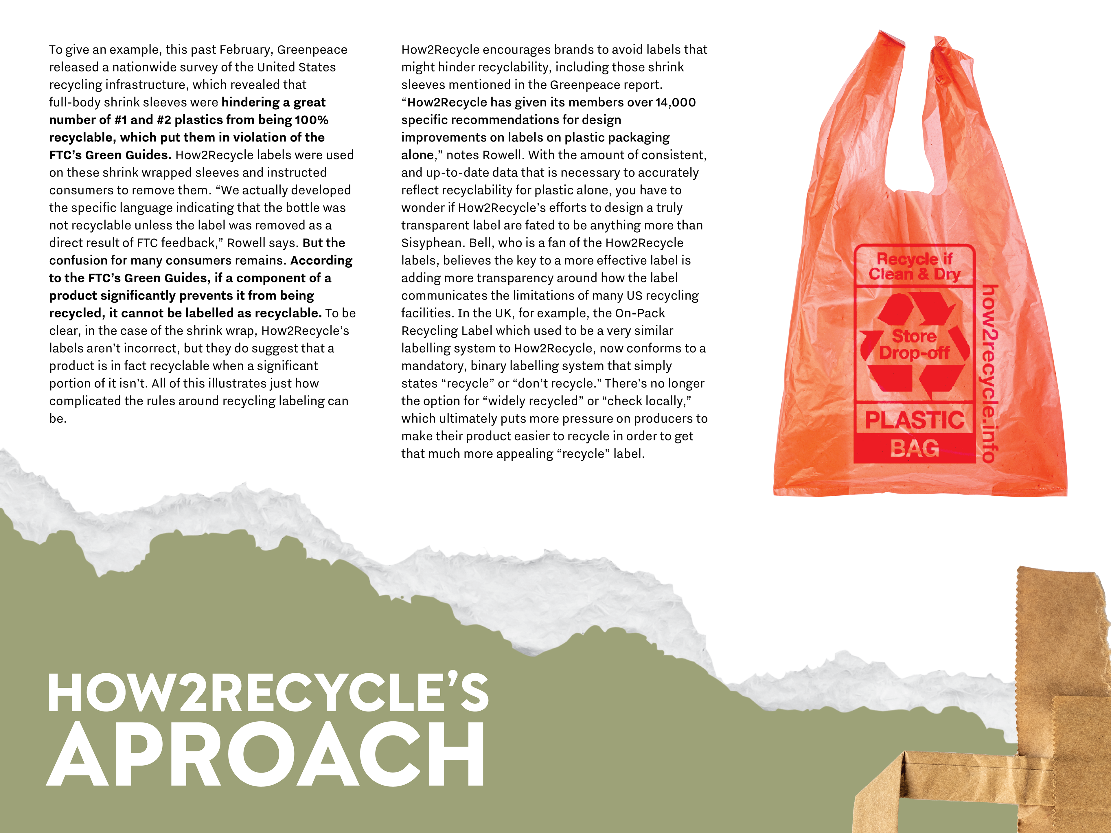
RECYCLING E-PUBLICATION DESIGN
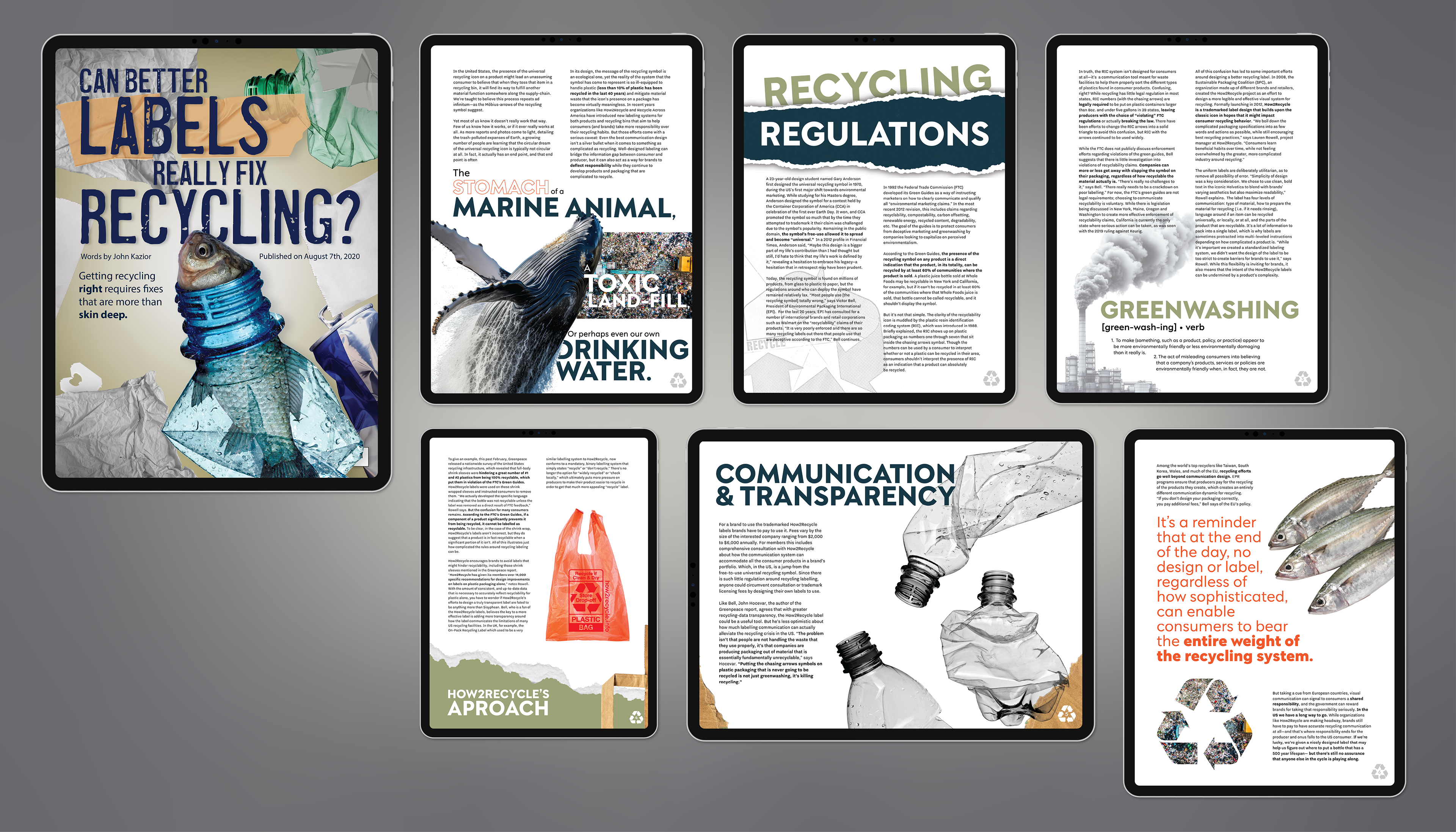
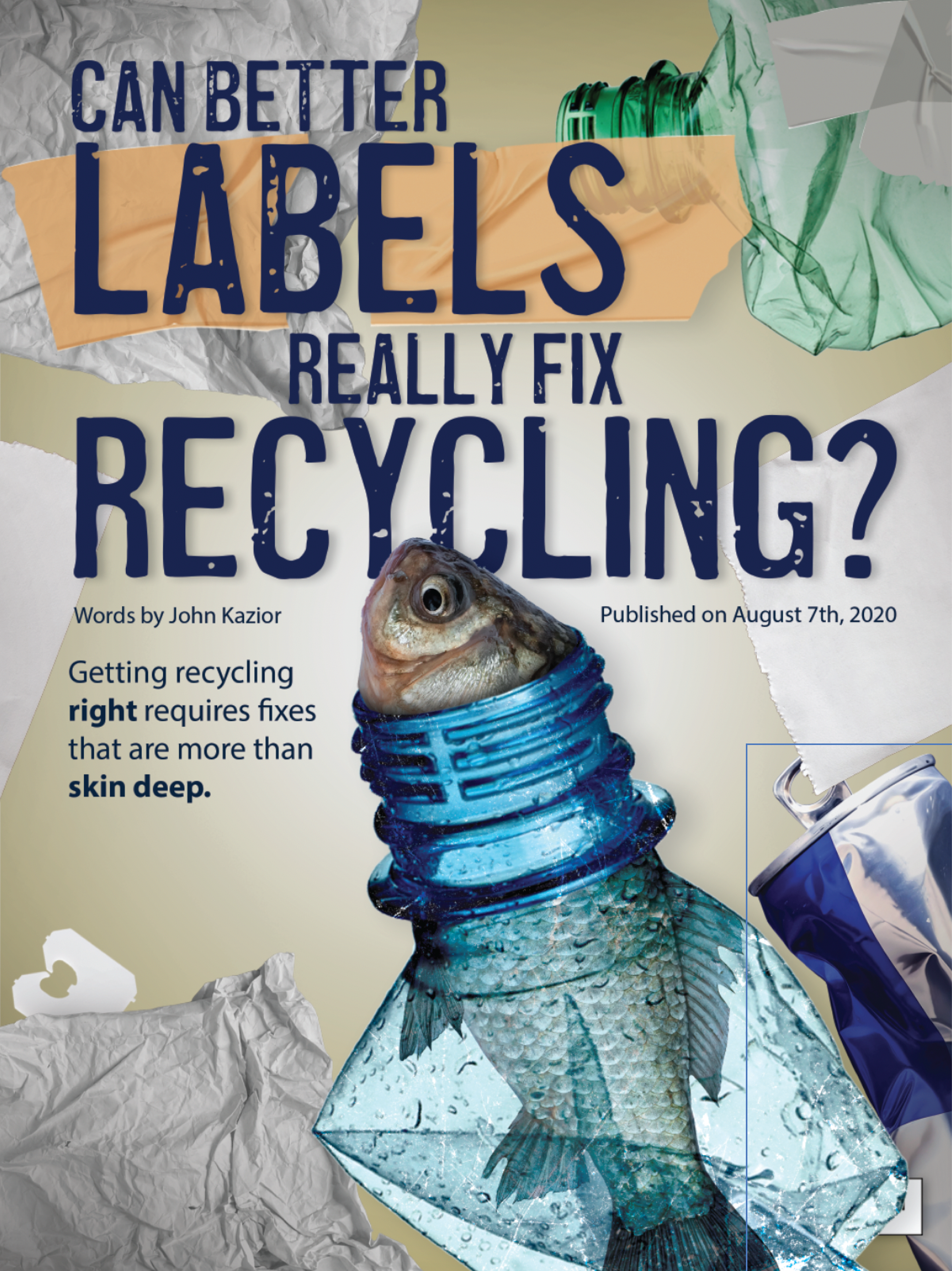
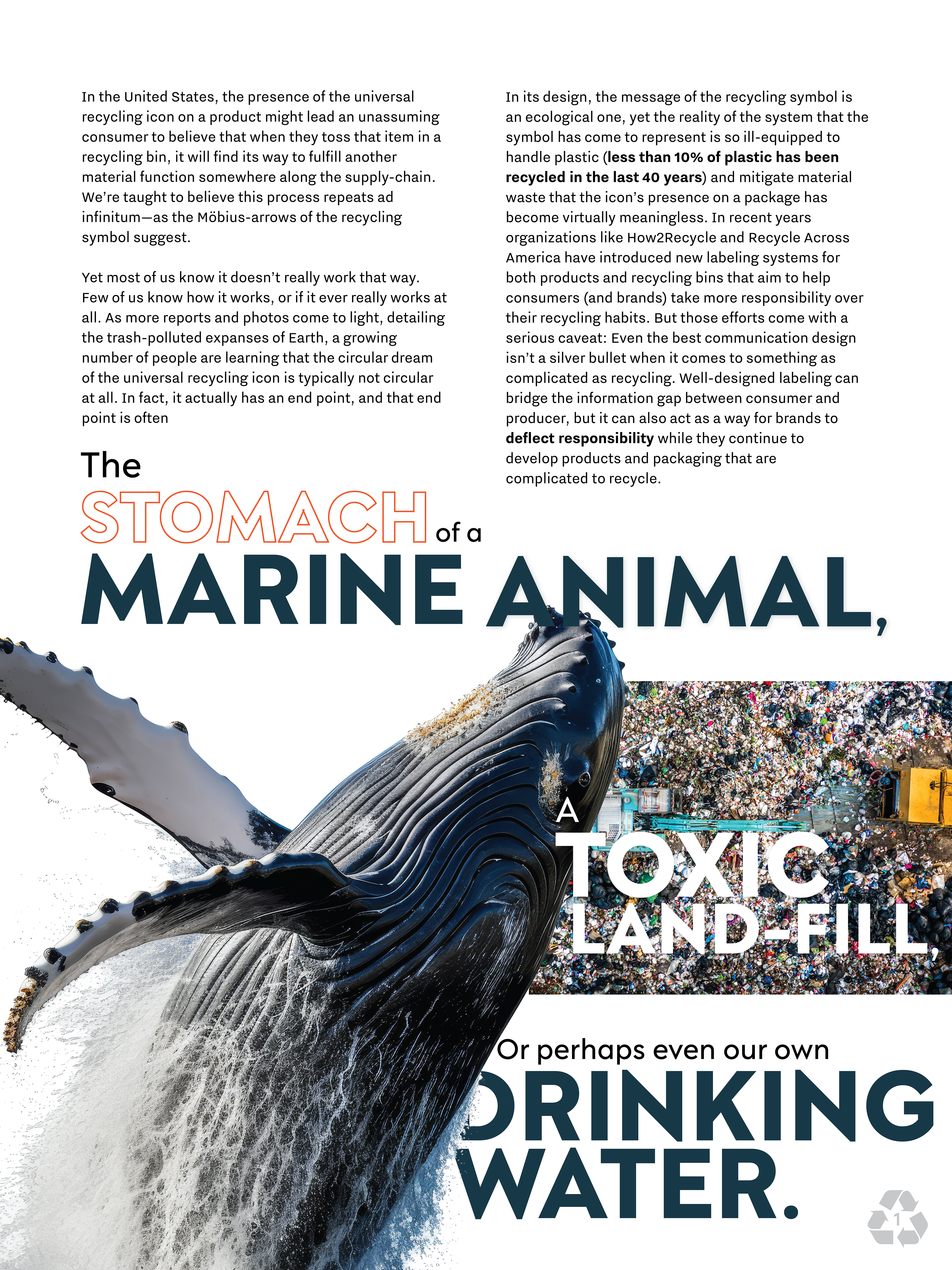
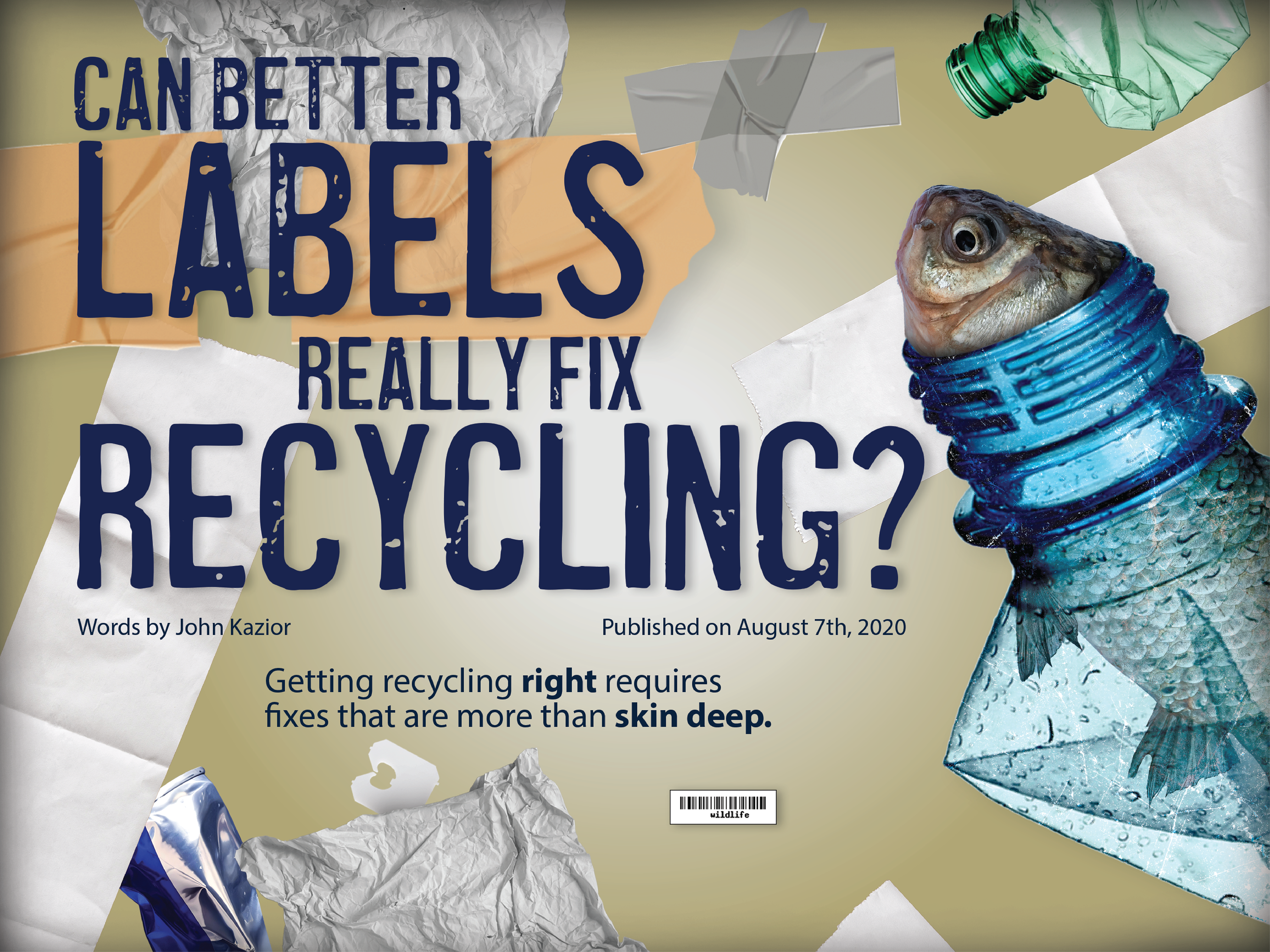
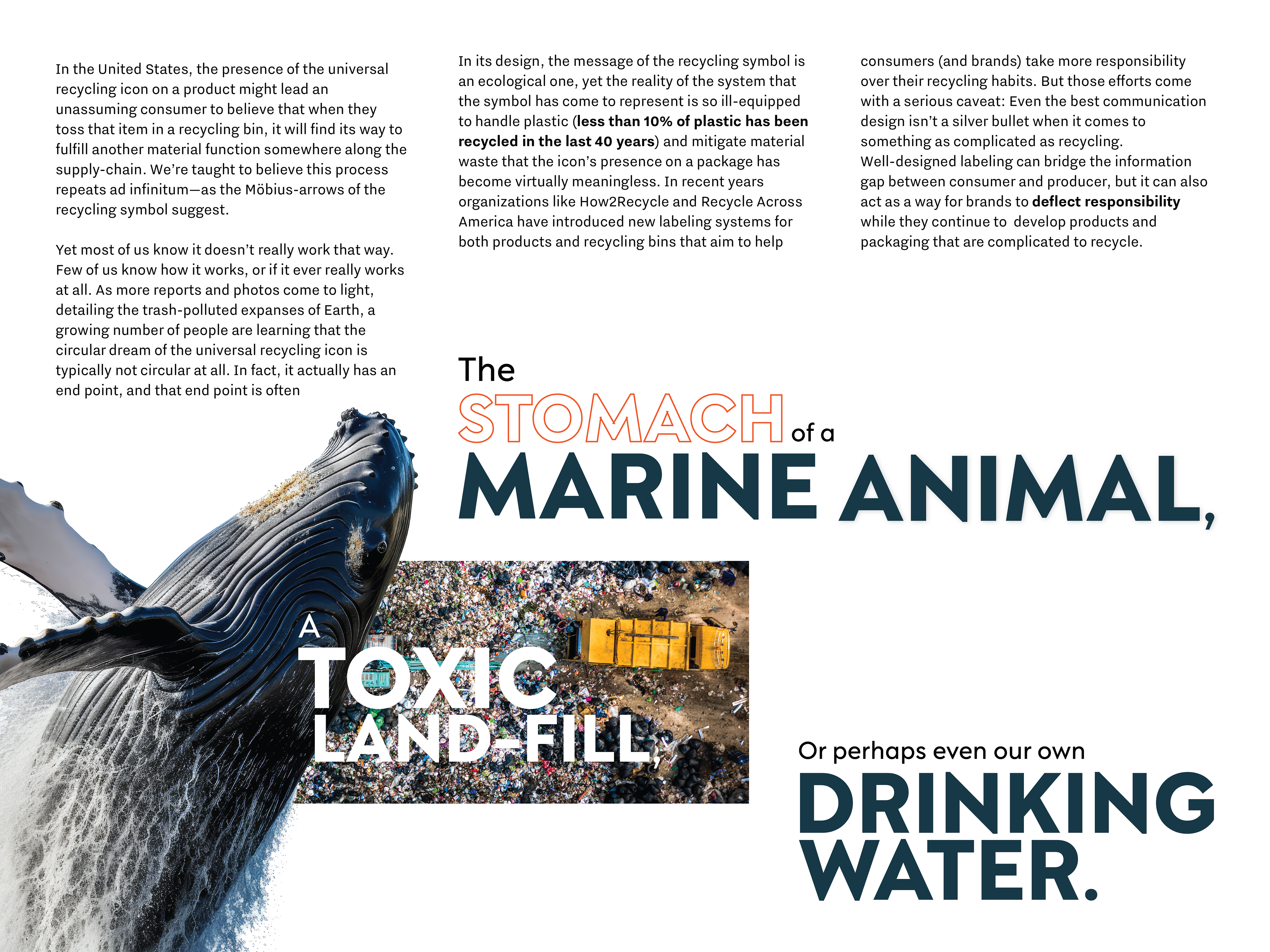
This e-publication design is a visual call to action, inspired by the article “Can Better Labels Really Fix Recycling?” from Eye on Design. The piece explores the disconnect between what we recycle and what actually gets processed, using impactful imagery of ocean life entangled in waste, drifting labels, and tossed-aside packaging to confront the consequences of misinformed recycling. With a color palette rooted in earthy green (sustainability), red (danger), and blue (life and ocean), the design aims to evoke both urgency and empathy. It’s structured to pull readers in emotionally while educating them on overlooked details—like labeling and sorting mistakes—that can make or break the recycling cycle. The publication encourages readers to not just participate in recycling, but to question and improve how they do it.
Vertical Format for E-Publication
Horizontal Format for E-Publication