INSECT VILLAGE & BOTANICAL GARDEN BRAND IDENTITY
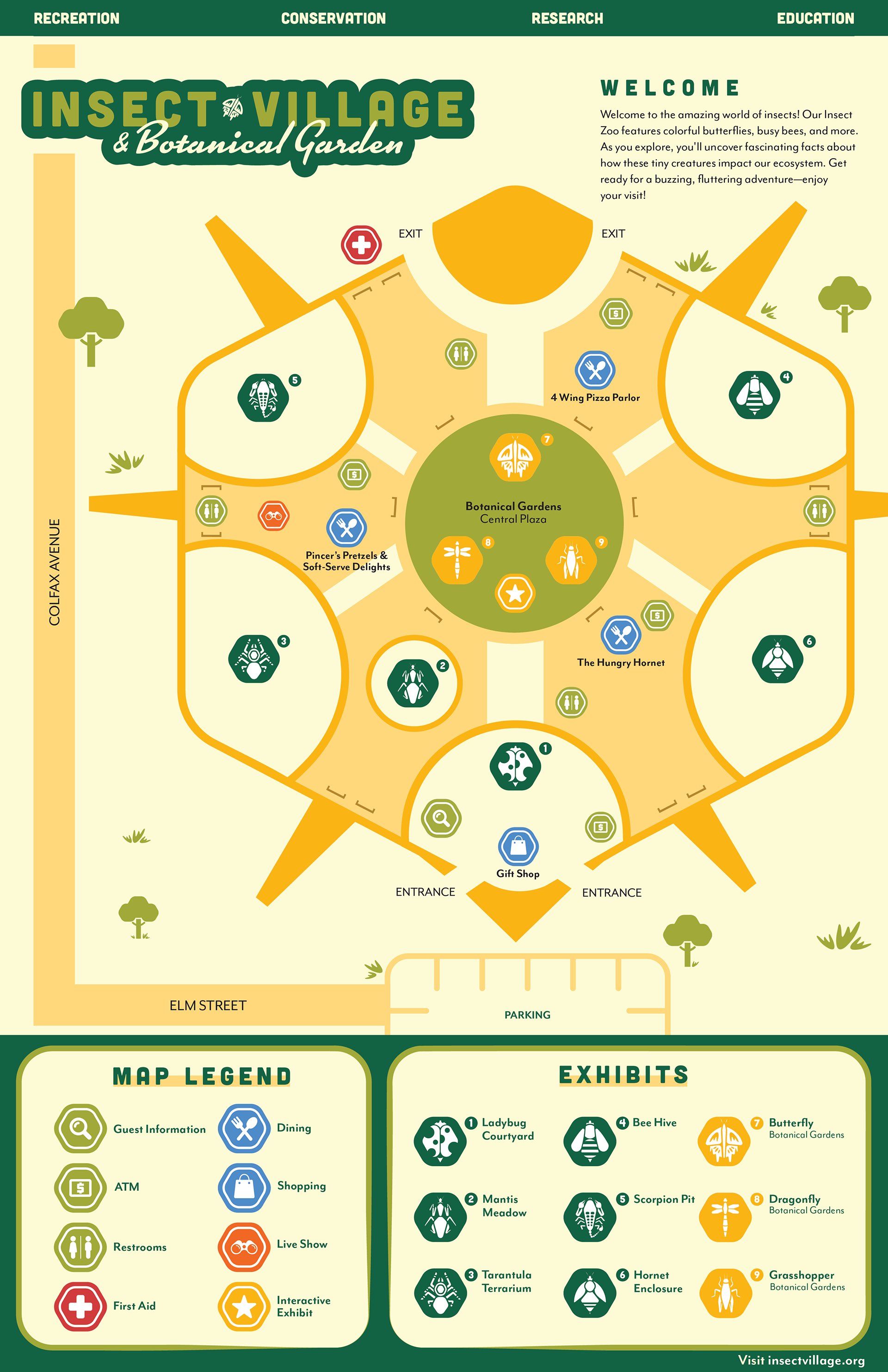
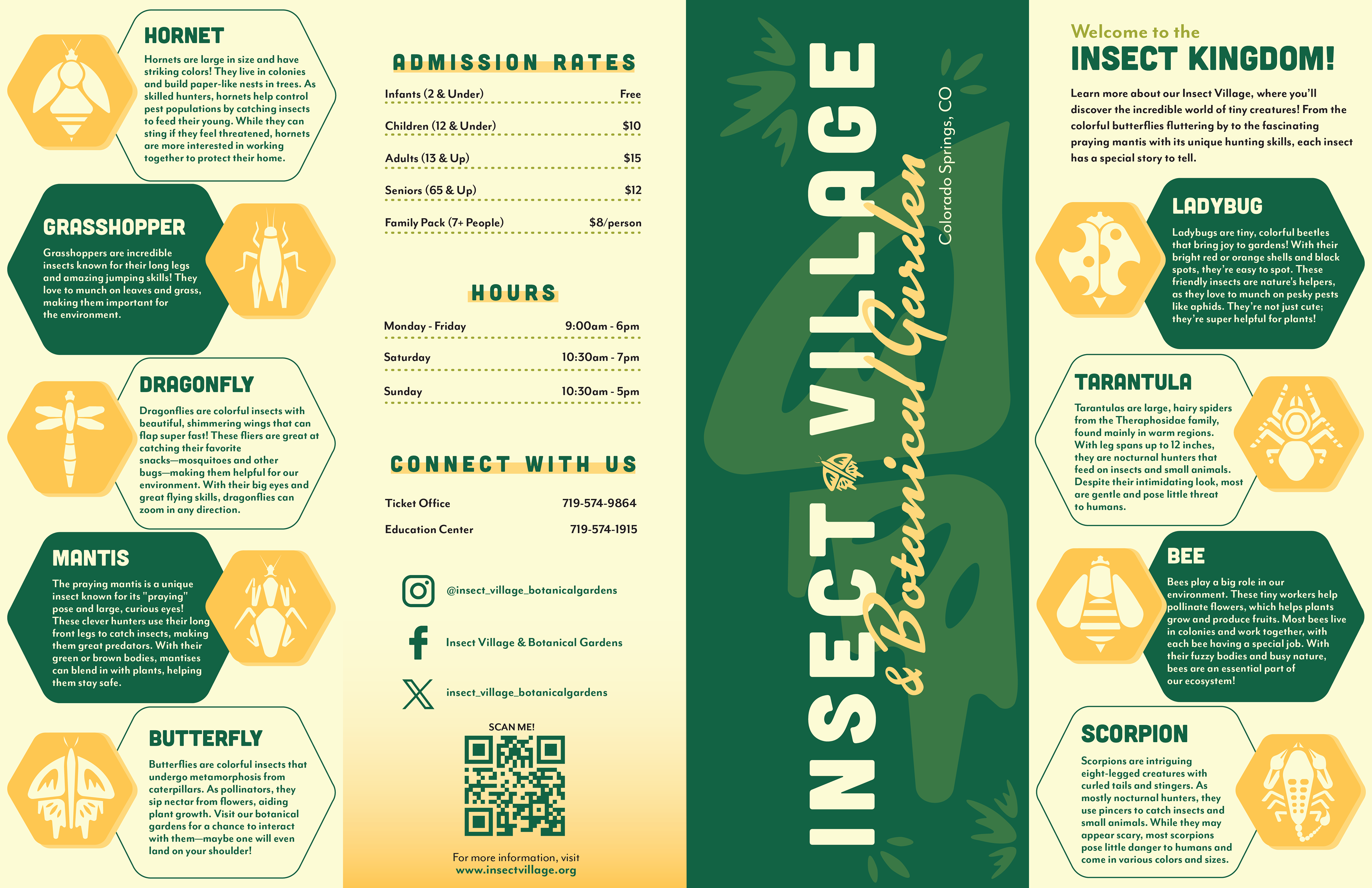
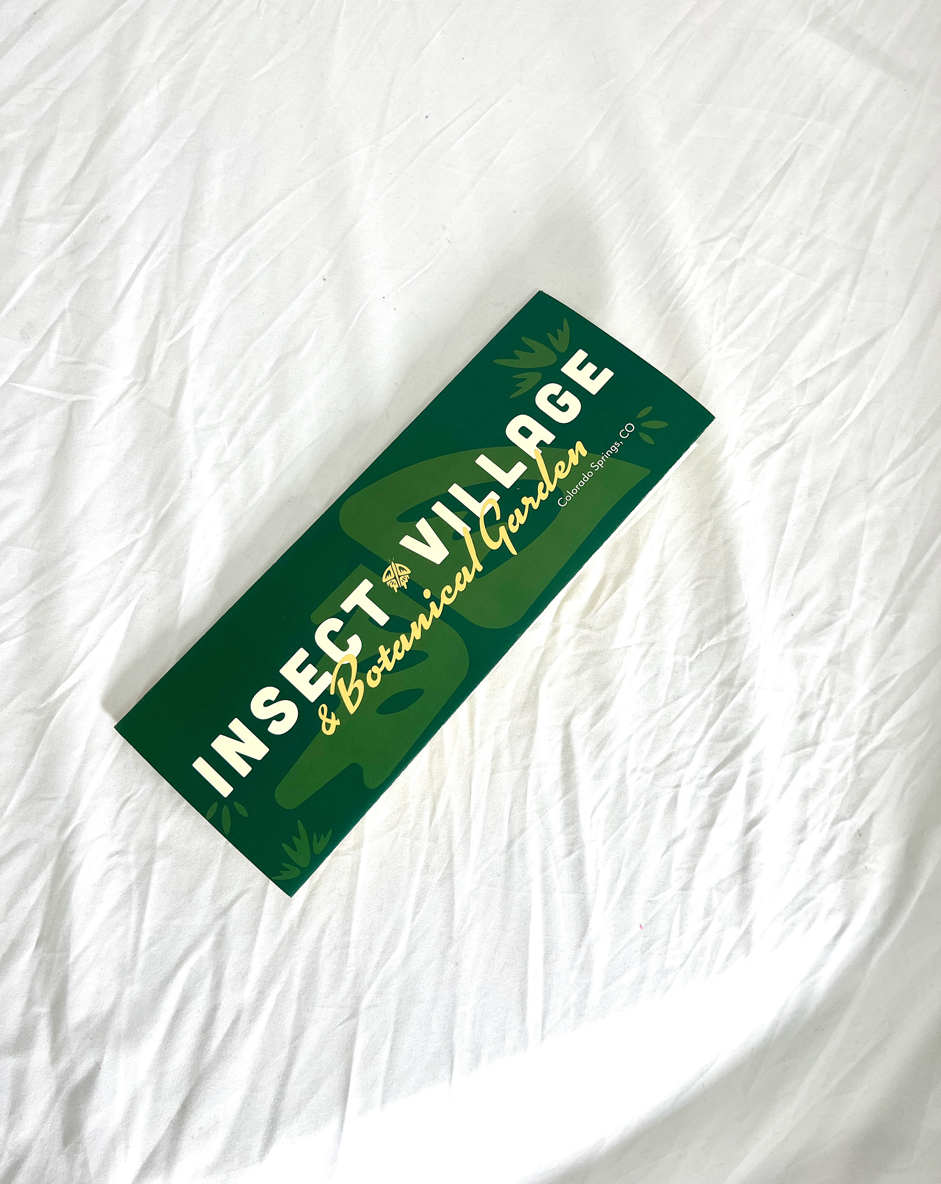
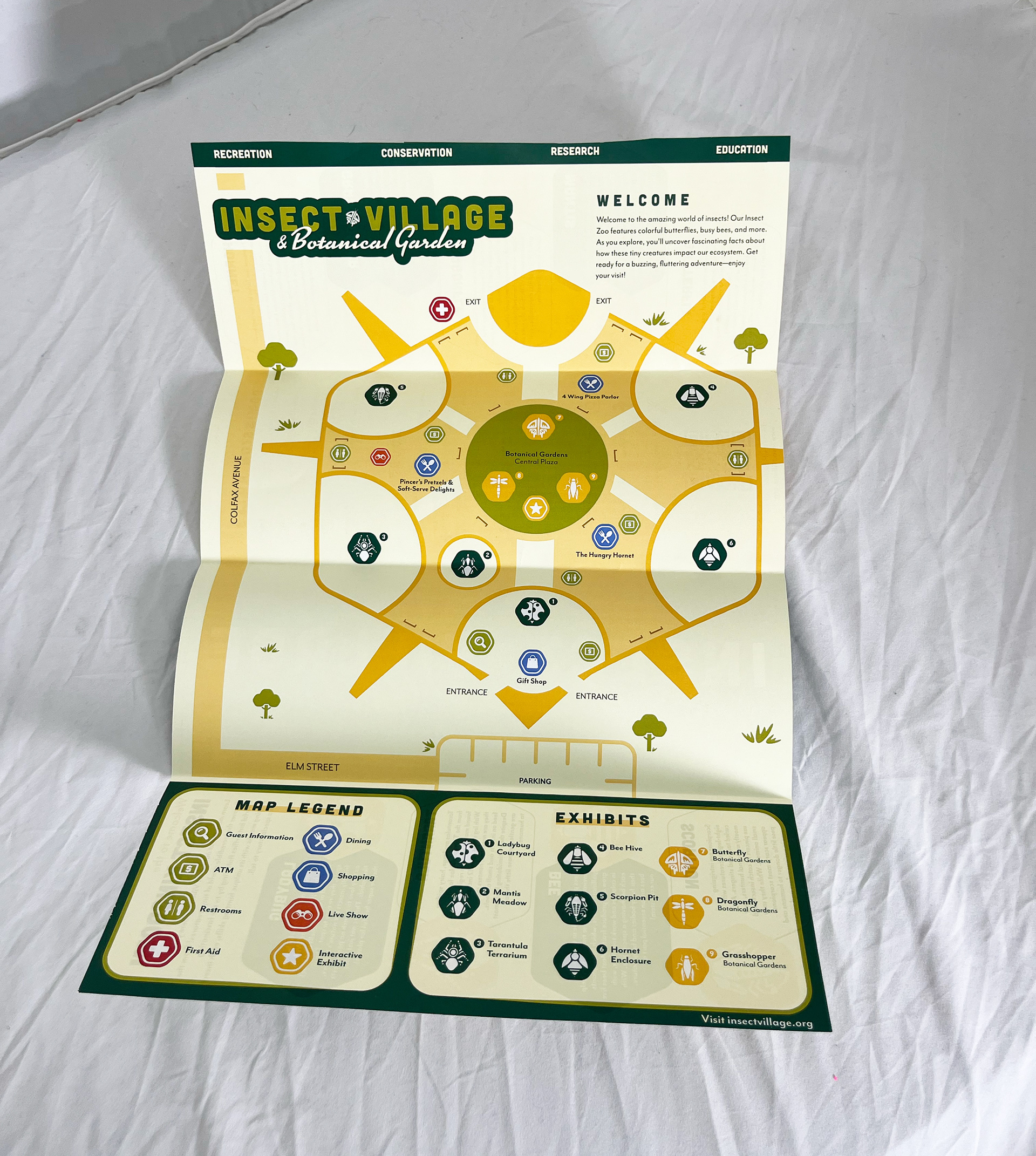
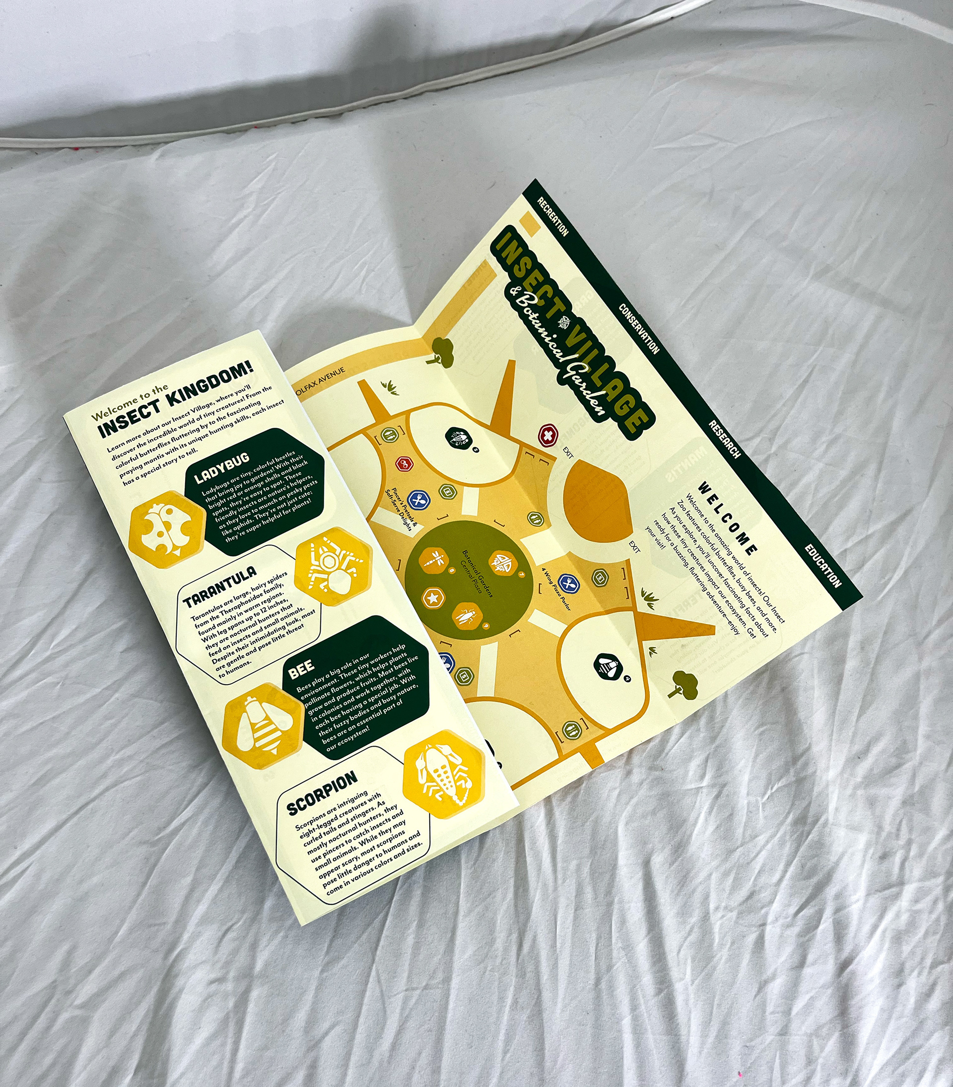
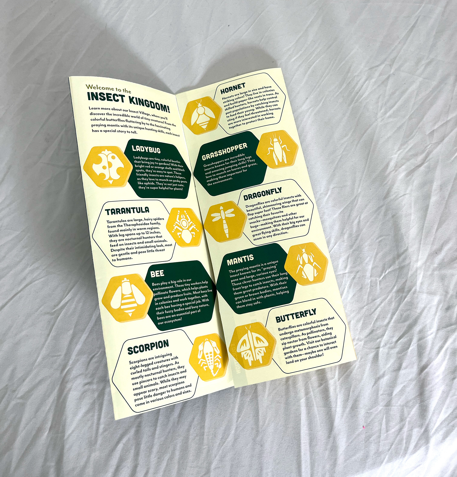
This project combines a series of stylized insect symbols with a playful, kid-friendly wayfinding map designed for a fictional “Insect Village & Botanical Garden.” The insect icons were created with a focus on figure-ground relationships, closure, and symmetry—drawing from Gestalt principles to build clean, minimalist forms that are instantly recognizable without being overly detailed. Designed from a bird’s-eye view, each insect uses negative space to suggest segmentation, while subtle details like stripes, antennae, and wing shapes give each one its own identity. For the map, I leaned into bright, nature-inspired colors and approachable typography to strike a balance between fun and clarity. The final design includes a custom logo, intuitive layout, and cohesive type choices (Cubano, Kinescope, and Mr Eaves) that tie everything together visually. It’s informative, inviting, and designed with both kids and parents in mind.
